RC, Small Batch Winery
When RC came to us, they were a small, two-person setup focused on creating top-notch artisanal wines using old-school methods. As a fresh face in the wine world, they wanted to communicate their core values of simplicity, quality, and craftsmanship in an approachable way. So, we got to work to developing a logo and label design that captured their ethos.
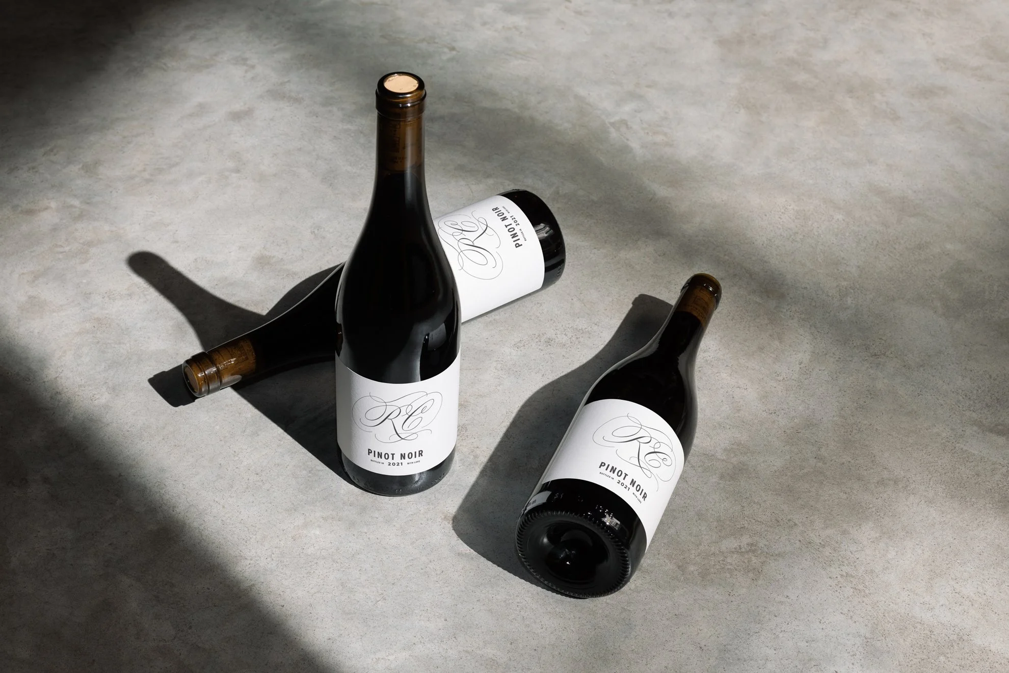
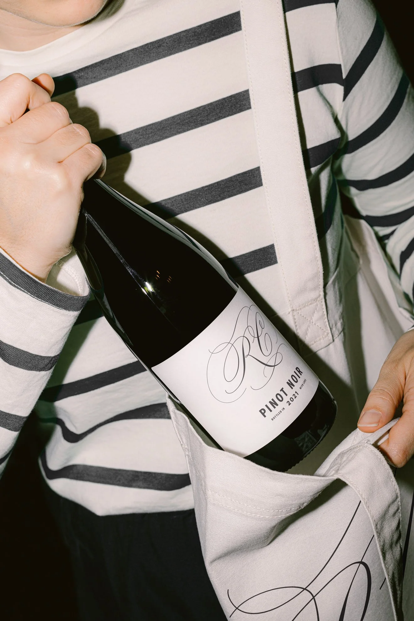
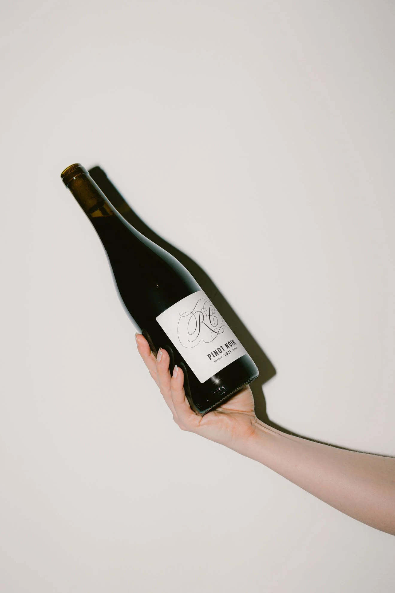
For the logo, we landed on an abstract monogram forming the letters ‘RC.’ The sweeping curves speak to the organic, fluid winemaking process, while the crisscrossing lines add movement. To compliment the mark, we chose Trade Gothic, a no-fuss sans serif typeface. Its clean lines pair nicely with the mark for a contemporary vibe.


The refined yet welcoming brand identity captures the spirit of RC's small batch wine to a tee. Through simplicity and craft, they stand out while conveying their total dedication to quality winemaking.